Design choices are more than visual. They communicate intention, tone and emotion. Fonts, colours and finishes are the first impression your guests will receive an introduction to the celebration to come. This guide will help you select the right elements with clarity, confidence and elegant restraint.
Start with Your Tone
Before choosing a typeface or palette, decide how you want your day to feel. Romantic and ornate. Timeless and smooth. Classic and formal. Every visual choice should support that mood.
Your wedding stationery sets the tone long before your guests arrive. Make each element a reflection of your values and vision.
Choosing Fonts with Story and Style
Fonts are impactful. They shape how a name feels on the page. At Story of Elegance, we use a curated set of typefaces across our wedding collection, each chosen to complement a particular kind of celebration.
Our Signature Collection
-
Oath
A classic serif inspired by Baskerville. Elegant, structured and steeped in tradition.
-
Cherish
A soft serif with timeless curves, based on Cormorant Garamond. Warm, graceful and versatile.
-
Union
An architectural all-caps serif based on Copperplate. Clean, strong and refined.
-
Promise
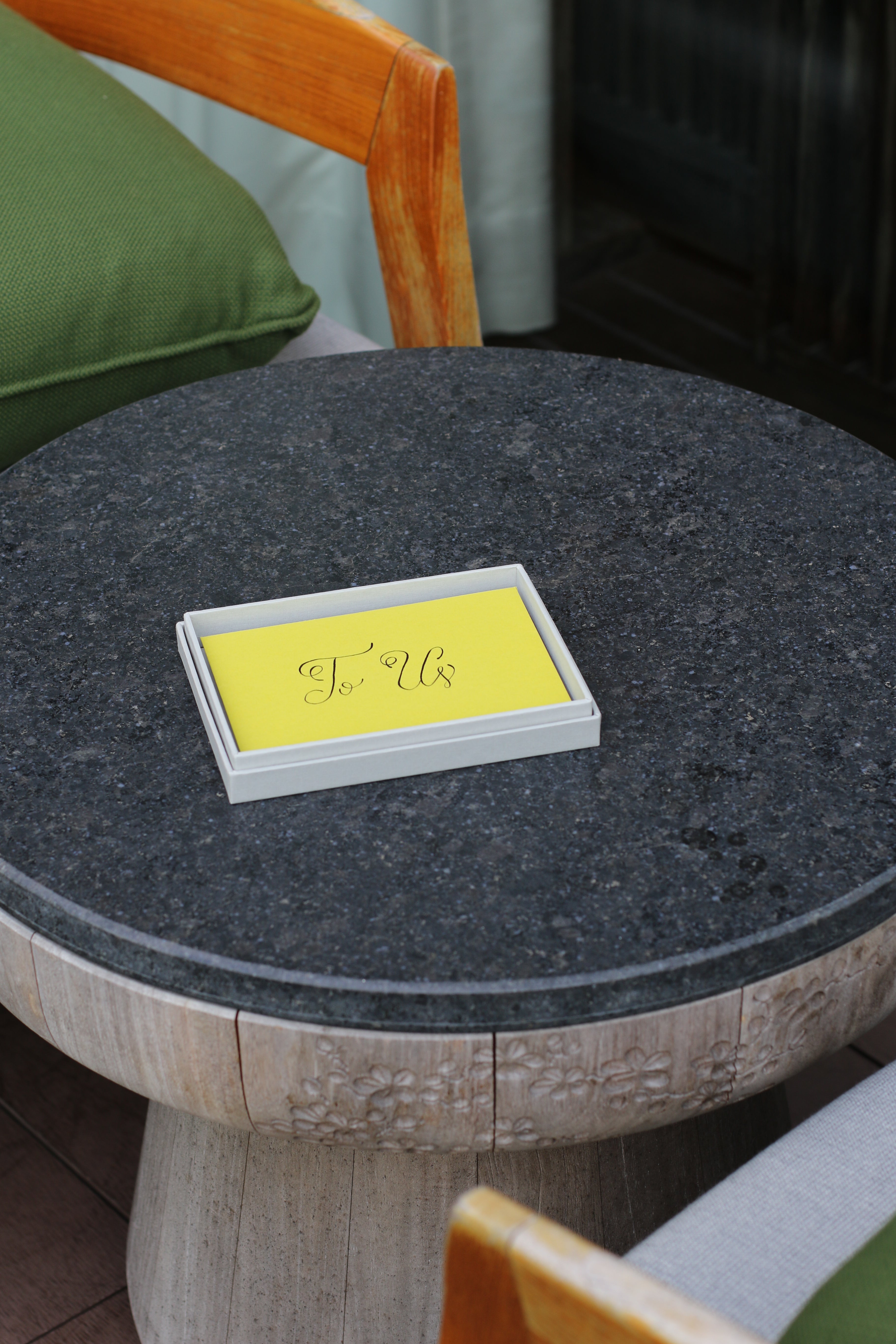
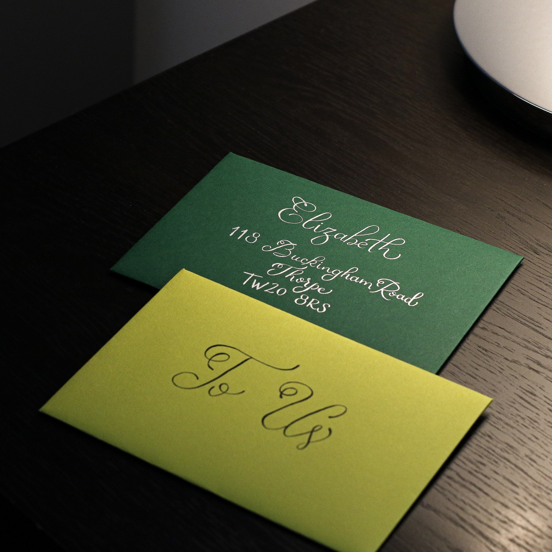
A romantic calligraphy script inspired by Snell Roundhand. Flourished and expressive.
Use no more than two fonts per design. One for names or headings, and a secondary for supporting details.
Creating a Palette That Feels Like You
The right colour palette speaks quietly but clearly. Our signature colourways are designed to feel both modern and timeless, offering a choice of moods that blend naturally with our finishes and papers.
Our Curated Palettes
-
Regency
Black, charcoal, mid grey, pale grey and white. Classic, architectural and formal. This is our most structured and tonal grouping.
-
Ravella
Lilac, aubergine, burnt orange and saffron yellow. Bold and expressive. Feels sun-warmed, rich and lively. A modern palette with presence.
-
Riviera
Deep green, sage, mint, pale aqua, sky blue, royal blue and navy. Refined, cool and coastal. This spectrum captures freshness and balance.
-
Rosewood
Dusty rose, clay, blush and soft almond. Romantic, soft and heritage-inspired. Designed for warmth with timeless character.
Choose one anchor tone, and allow secondary shades to support it gently.
Selecting the Right Finish
Finishing elevates the experience of your stationery. It adds texture, depth and a sense of presence. Each technique offers its own expression. At Story of Elegance, we offer a focused set of luxury finishes designed to enhance timeless wedding design.
Our Signature Finishes
-
Letterpress
Deeply impressed, tactile and elegant.
-
Hot Foil
Gleaming metallic detail that brings polish and light.
-
Blind Emboss
Crisp, raised texture with no ink. Clean and sculptural.
-
Blind Emboss with Foil
A dual-layered technique for depth and definition.
-
Engraving
Crisp, traditional and refined. Engraving offers precision and prestige.
Please note that, we do not offer digital or flat printing. Every suite is produced using traditional printmaking methods that honour fine paper and thoughtful design.
Making the Details Feel Intentional
Elegance lies in restraint. Let margins breathe. Use contrast gently. Allow white space to frame the page. Our design team ensures every layout is balanced, from name placement to line height, so nothing feels crowded or loud.
A Final Thought
Fonts, colours and finishes are not decoration. They are part of the language of your wedding. When chosen with care, they offer clarity and emotion. They ensure every part of the experience feels unified and considered, right down to the paper in your hands.

Should You Send Save the Dates? A Guide to Timing and Tradition
Your Wedding Stationery Checklist: What To Include and When To Post